- Fast and Painless Magento Admin Navigation
- Building the Pulse Storm Launcher: Menu Data
TL;DR; Technical people are users too. I’ve built a new, open source Magento extension for lightening fast admin navigation. You can get it from the Pulse Storm GitHub, or download the module files here. (Update: We’re now on Magento Connect as well)
Brief Me
About a year ago I was building a Magento extension for a local commerce startup, and one of their junior interactive designers looked at the admin console, and then in a loud voice proclaimed
Woah, this is horribly designed
I bit my tongue and didn’t say anything, because I’ve found junior “creatives” to a be a little thinned skinned when they’re forced to defend a poorly formed critique, and challenging them wasn’t going to help finish the project.
Style is how it looks, Fashion is how it looks compared to other things, Design is how is works, Engineering is how it’s built
The quote above is what I wanted to say, and how I’ve learned to navigate the style/fashion/design/engineering arguments that never end. What that interactive developer was complaining about was fashion. The Magento admin console looks a little long in the tooth compared to current trends in interactive design, however its style, while maybe not to a particular person’s taste, is consistent and well executed.
Its “design”, the thing the junior creative was supposedly complaining about, is trickier to comment on. It’s almost impossible to critique the design of something unless you’ve seen the design brief. According to Wikipedia a design brief is
a written document for a design project developed in concert by a person representing the business need for design and the designer. The document is focused on the desired results of design – not aesthetics.
A critique without knowing the design brief is, ultimately, futile.
User Interface vs. User Experience
Magento Inc’s development methodology used a “model first” approach. At the start of any project, a developer should
- Break the problem down into objects (a product object, a customer object, etc.)
- Further break the problem down into data properties of those objects
-
Build a UI for entering those objects into the system
-
Build frontend UI that incorporates those objects into features
The Magento admin console, like most CMS systems, isn’t a designed user experience. It’s an engineered UI meant to cover step #3. So the design brief for the admin console probably read something like this
Design a system and user interface for editing arbitrary objects and displaying those objects in lists
Now, that’s (rightfully) not very fashionable in consumer software development, but the Magento’s admin console isn’t a consumer facing application. It’s a business application meant to be operated by people with a modicum of technical skill who understands e-commerce.
Would is be awesome if Magento (and other CMS systems) started designing their admin interfaces as consumer facing applications? Maybe, but stop and consider Magento as The Startup™. If you include the configuration system, there’s literally hundreds of objects to edit. Each of the designed user experiences for those objects (or features) could easily take three to six months to complete. If Magento had stopped to do a “proper” user experience design for each admin section it would
- Still be working on a version 1.0, or
-
Would have had much fewer features, which would have weakened their broad appeal, and Magento may never have grown into the platform it is today
It can be a bitter pill to swallow when you’re in the trenches, but sometimes a less complete user experience is the right decision for a software platform to make. Time to market matters. More features matter.
Better Admin Navigation
All of that said, the Magento admin console isn’t my favorite application to work in. Windows style hierarchical menus fight against Fitt’s Law, and the sheer number of options can be overwhelming when I’m looking for a specific thing.
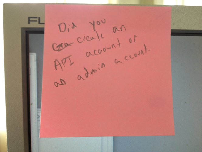
This post-it note from my monitor says it all

That’s where the new Pulse Storm Launcher module comes in.
Inspired by applications like LaunchBar, the Pulse Storm Launcher gives you one-click/one-key access to a lighting fast admin navigation.
Bring up the interface, type in a few words

and the launcher will quickly show you matching admin console links. I’ve been using it for a week and I already loath working on client sites where it’s not installed.
The launcher isn’t available as a Magento Connect extension yet. I’d like to get a few people using it to flush out any show stopper bugs. You can download the files for manual installation here, or grab it from the Pulse Storm github account. Questions, comments, bug reports, and feature requests are welcome in the comments below.
