A short while ago, Google rolled out some minor, but significant changes to it’s Maps product.
The most visible, and welcome, were tab-style links that let you Search the map, Find Businesses, or Get Directions. Previously Google would attempt to guess what you were doing, and then give you different options on the second page (unless you knew the verbose, super geeky advanced search terms)
Less visible, and far less impressive, are the changes made to the printing, particularly driving directions.
Printing Google maps has always been a bit of a hassle. You had two options, Google’s circa 1999 “Print” link, or your browser’s good old File -> Print command. Both would give you a simple page with the map on top and the directions on the bottom. If you printed with your browser’s print command, you’d get a portion of the current map view, and a little box that said something to the effect of
To view all the details that are printing on the screen, use the print link next to the map
If you used the “print link next to the map”, google would attempt to encompass your entire route on the printed map. Sometimes this worked, usually it did not.
Also, unless your route was short, the steps would almost always spill out onto the second page. Sometimes, even if you had a short route the copyright notice would force a a second page break.
These were annoyances, but were pretty simple to work around. I usually resorted to zooming in on the trickiest part of my route, printing the first page only, and then writing in the additional steps on my paper by hand. Irritating, but far less irritating than mucking about with multiple map pages in the car, on the bike, or on foot.
With their latest release, it looks like the Google Maps team tried to address the less than stellar printing user experience. Unfortunately, the end result looks like something that came from a committee that never uses the product but nonetheless can say they addressed every item on their user-feedback to do list.
First, let’s cover the in browser printing command. This gives us a page similar to our old printable page, with one small exception.
Instead we get a simple list of directions. Without the map there, we do indeed avoid the problem of longer routes spilling out on to two pages. We also loose all the context that a printed image brought. Aside from the draggle maps, the most striking improvement the original Google Maps brought to the table was big, giant, user friendly maps that you could actually use to navigate and get yourself back on track once when you missed the inevitable turn at Albuquerque.
At first I thought it might be the old “background images aren’t being printed” problem, but even after turning on background image printing, the map was still missing.
OK, the Google Maps Team must really want me to use that print link, I’m game
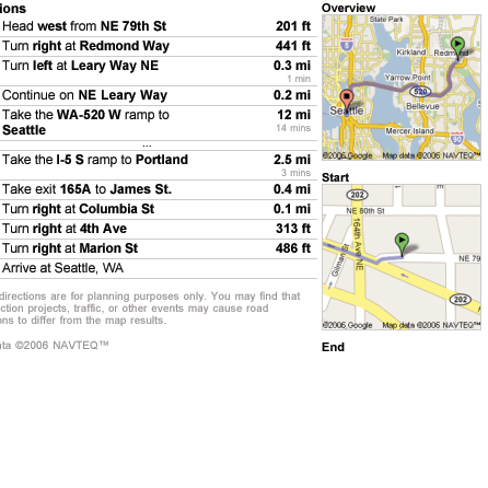
Clicking on the print link pops up a new, chromeless window (did google hire Anil Dash?), with the directions in a column on the left, and three map windows down the right hand side.
Cool work google, I get an overview image, a “start of the trip” image, and N “end of the trip” image. Everything I need to get where I want to go. Although, that end of the trip image is kind of tiny and useless. Oh, cool, I can zoom and adjust each one of the maps. There, that’s a little better, now lets print ‘er out again …
As you can see, making any adjustment to one of the little maps renders it unprintable.
Now, that’s a bug for sure, and hopefully one the Google Maps team is aware of and working on a fix for. End users, however, should never have seen this bug. “We’re pushing out a broken version of the feature we’re trying to improve” is always a show-stopper in my book.
Let’s, for a second, pretend Google has a different book, or that the bug doesn’t exist. Two hundred square pixels or so of space isn’t enough to get a useful chunk of map into. To get the area of coverage you need for a useful map you have to sacrifice detail, which renders the map useless.
Again, this looks like a feature that was implemented to satisfy an item on a checklist rather than address the actual problems raised by users.
Before we wrap up, a few other little nitpicks.
- There’s a little field that lets you add notes to your printed map, which is kind of neat. Of course, to use it you have to cancel the print dialog, enter the notes, and then reprint the page. Clumsy user experience.
- The print-only page isn’t bookmarkable. It appears to populate itself based on the content of its launcher window. Close the launcher window, reload the print only page, and you get nothing. The significance of this varies depending on your take of the page vs. application role of the web. I think it’s amateurish for a public facing, information providing web application.
Beyond being an irritated customer who can no longer print his maps without resorting to screen shots, this highlights a few of the challenges Google faces as it continues to grow from a just-went-pubic company to an established industry player.
You read a lot about how hard it is to release a “1.0” in the software world. Less attention is paid to how difficult is is to maintain said piece of software while still adding new features. This is even more difficult in a large company environment, where the original players have moved on to more interesting things, leaving their pile of slightly documented code to be picked up by the fresh new hires who thought they were going to be writing kernel modifications and ended up hacking on Javascript.
Speaking of Javascript, as long as we’re here I’d like to take a moment to bitch about Google, and other companies in the “AJAX” space providing piss poor Mac support. I know IE and Firefox have a lot more sexy, dynamic content features that make the lives of developers easier, but the whole point of AJAX was we finally had a set of mature, stable, and well understood tools that worked on Windows, Macintosh and Linux based computers. When you approach a project with the Safari Later™ attitude, you end up with a harder to maintain product, or a less than stellar user experience for Safari users. From there it’s just a hop-skip-and-a-jump back to DHTML land, and I thought we’d outgrown that.
The cynical money says you’ll see a lot more cruft like the above enter Google’s existing products. Without any financial incentive (free product, no lost sales) all you have to guide you is how invested each team member is in the product. And to paraphrase the infamous quip bandied around about the fall of Netscape, the larger a company gets the more they attract people who want to work for a successful company, as opposed to people who want to work to make a company successful.
I hope Google proves to be the exception here, since they’re a rather ubiquitous part of using a computer these days. But, as an old co-worker used to say, “If wishes were horses, beggars would ride”
Standard disclaimers
I should note that the above was my experience using Firefox and Safari on OS X. Google often attempts to leverage different features of different browsers to provide a better experience, so things may be different on IE Windows.
Also, I’m basing descriptions of the prior printing behavior on memory, and may be misrepresenting exactly how something worked.

